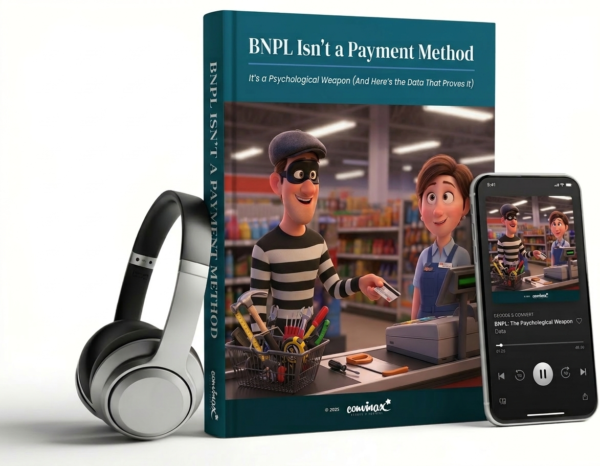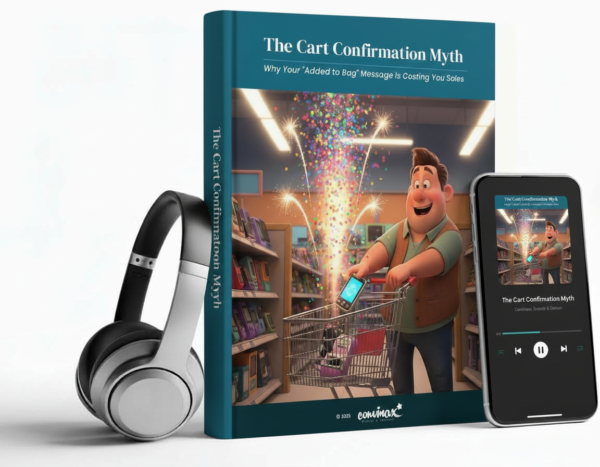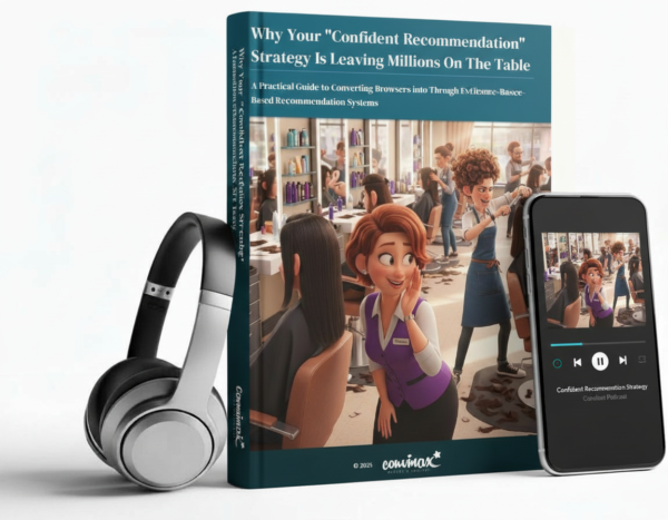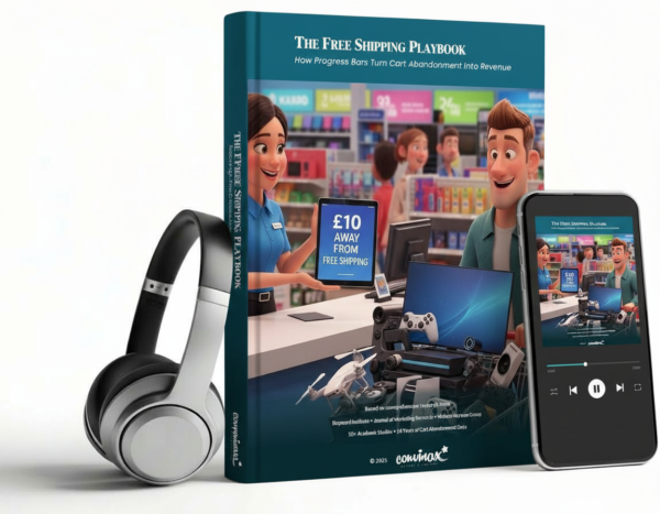
Description
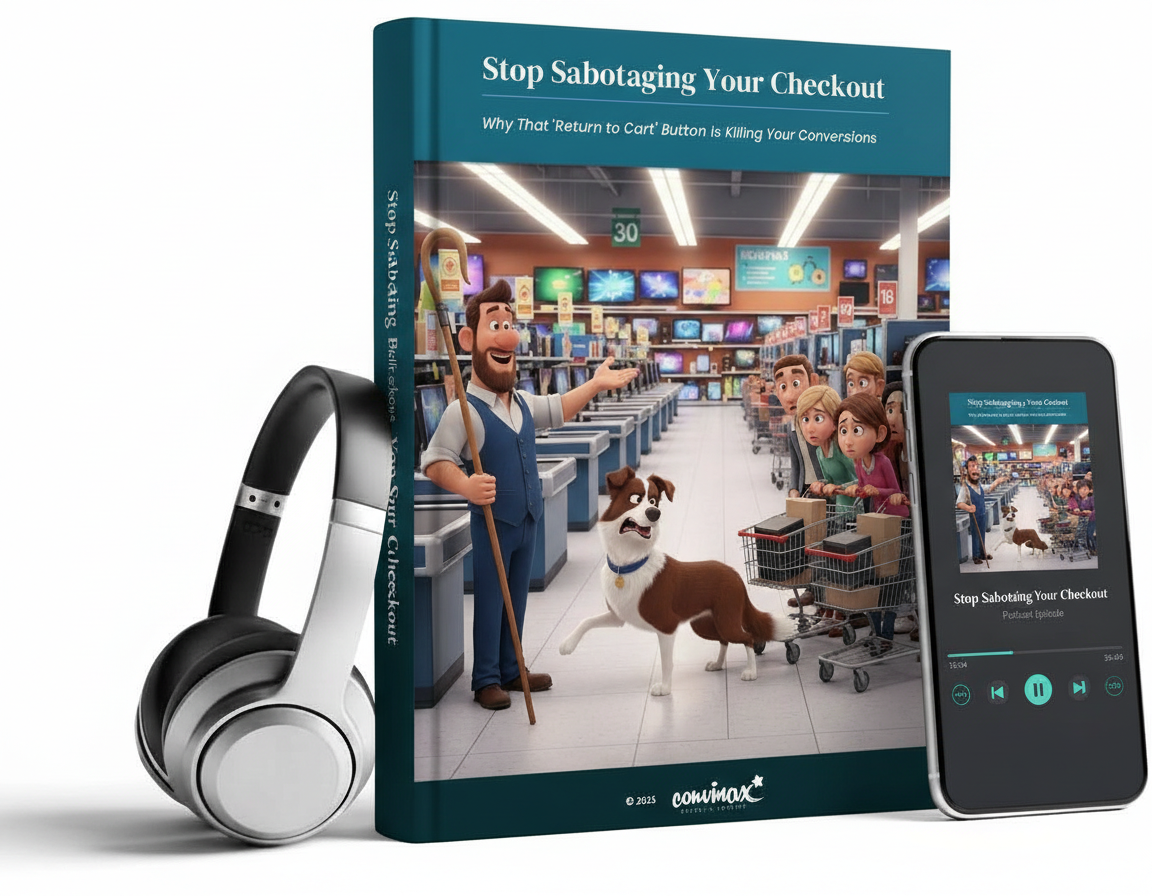
STOP Being Helpful: Why Your “Return to Cart” Button is Quietly Killing Your Sales (And How to Fix It)
Your checkout is broken.
Not because it crashes. Not because it’s slow. It’s broken because you’ve built exit ramps right into the moment when customers are ready to pay you.
That “Return to Cart” button? The one you added to be helpful? It’s costing you thousands – possibly millions – in lost revenue. And nearly every e-commerce site makes this exact mistake.
Here’s What Most People Get Wrong
Everyone obsesses over traffic. Over ad spend. Over getting people to add items to their cart.
But here’s the brutal truth: 70% of people who add items to their cart never complete the purchase. On mobile, it’s even worse – 85% abandon.
You’ve done all the hard work. Built the product. Created the marketing. Got someone to your site. Convinced them to add items to their cart.
And then your checkout design whispers: “Maybe you should go back and think about this some more.”
What You’ll Discover in This Article
This isn’t theory. This isn’t opinion. This is documented, evidence-based research showing you:
- Why that “helpful” button is actually sabotaging your sales (the psychology is fascinating)
- Real case studies of companies that doubled conversions by making one simple change
- The exact revenue impact you’re missing (with the maths to prove it)
- Platform-specific data showing why mobile is haemorrhaging your profits
- Step-by-step implementation you can test today
- What the world’s leading UX research institutions actually recommend (hint: it’s the opposite of what most sites do)
You’ll see the A/B test results. The conversion data. The revenue numbers. Everything is backed by research from organisations like the Baymard Institute, Nielsen Norman Group, and real-world tests from companies just like yours.