1
Shipping
Where to ship it?
Your cart is currently empty.Continue shopping
Subtotal £0.00
Total £0.00 GBP

Your Information

Order Summary

Product
Total
Subtotal £0.00
Total £0.00 GBP

Payment Information

All transactions are secured and encrypted.

Your personal data will be used to process your order, support your experience throughout this website, and for other purposes described in our privacy policy.

Please note: Results may vary and are not guaranteed.
Due to the digital nature of this product, we do not offer refunds.

  • 256-Bit Bank Level Security
  • 100% Secure Payments

Who This Is For

This article will be most valuable if you:

  • Manage conversion rates for an e-commerce site or digital product
  • Design user experiences and need psychological frameworks that actually work
  • Run a small business and handle your own website optimisation
  • Work as a freelance CRO consultant and need evidence-based strategies for clients
  • Build side projects or digital products and want to maximise every visitor
  • Lead growth for a startup where every percentage point matters
ConviMax Logo

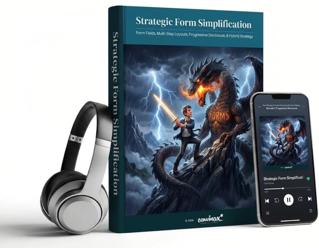
Strategic Form Simplification

Your Checkout Form Is Losing You Thousands – And “Keep It Short” Is Terrible Advice
Why the UK Government, Amazon and a £12 Million Mistake All Prove the Same Uncomfortable Truth About Your Checkout
You’ve read the advice a hundred times. “Reduce friction.” “Shorten your forms.” “Fewer steps, more sales.”
So you did it. You crammed everything onto one page, cut it down to a single “Continue” button, and waited for conversions to climb.
They didn’t move. Or worse, they dropped.
That’s because the advice you followed is only half right, and the half that’s missing is the half that actually moves revenue. Businesses lose an estimated £260 billion a year to checkout abandonment, and most of them are optimising for the wrong number entirely.
This research booklet and podcast lay out exactly what separates a checkout that converts from one that quietly bleeds customers, backed by Baymard Institute, Nielsen Norman Group, peer-reviewed behavioural science, and real case studies with real, attributable numbers.
No opinions. No “best practice” folklore. Just what the evidence actually shows, including the parts that contradict each other and the parts nobody in CRO wants to admit.

What You’ll Discover in This Article:
  • The article reveals why a single ambiguous field cost one major travel brand an estimated £12 million a year, and it wasn’t because the field was hard to fill in.
  • It reveals how one business turned a 0.96% conversion rate into 8.1%, a 743% increase, without ever showing customers the full list of what they’d be asked.
  • It reveals why cutting a form from 11 fields down to 4 caused conversion to jump 120%, with no drop in lead quality whatsoever.
  • It reveals the real reason mobile checkouts abandon at over 80%, and why the culprit isn’t screen size.
  • It reveals what the UK Government’s own research team discovered when they split one simple task across two separate screens, and why users didn’t even notice.
  • It reveals why one field marked “optional” is one of the cheapest, most widely ignored fixes in e-commerce, and what it’s quietly costing you.
  • It reveals the psychological principle borrowed from a coffee loyalty card study that explains why some forms feel effortless, and others feel exhausting, even with identical fields.
Your complete bundle includes:
  • Audio Podcast
    Listen anywhere. Perfect for learning on the go.
  • Blog Article
    A quick, engaging summary of the key ideas.
  • Detailed Booklet
    A deeper dive with examples and academic findings.

This isn’t theory. Every recommendation is backed by academic research, field studies, and real-world case studies. You’ll get the full academic citations, the industry benchmarks, and the practical frameworks you need to implement this tomorrow.

This booklet synthesises findings from:
  • Baumeister, R. F., et al. (1998). “Ego Depletion: Is the Active Self a Limited Resource?” Psychological Science. This study explores how sequential tasks requiring self-control deplete mental resources, supporting the need for simplified, guided form steps.
  • Hernandez, A., & Resnick, M. (2013). “Placement of Call to Action Buttons for Higher Website Conversion and Acquisition.” Research focused on visual hierarchy and the Gutenberg pattern to optimise user fixations and click-through rates.
  • Jankowski, J., Hamari, J., & WÄ…tróbski, J. (2019). “A Gradual Approach for Maximising User Conversion Without Compromising Experience with High Visual Intensity Website Elements.” Internet Research. An investigation into how visual intensity affects cognitive load and user discomfort during digital interactions.
  • Kivetz, R., Urminsky, O., & Zheng, Y. (2006). “The Goal-Gradient Hypothesis Resurrected.” Journal of Consumer Research. Foundational work on the Goal Gradient Effect, demonstrating that visible progress indicators increase motivation to complete a task.
  • Lurie, N. H., & Mason, C. H. (2007). “Visual Representation: Implications for Decision Making.” Journal of Marketing Research. This research establishes that high information processing costs lead users to abandon tasks or rely on simplifying heuristics.
  • Urban, G. L., et al. (2013). “On the Measurability of Information: A Field Experiment in E-Commerce.” Marketing Science. A field experiment proving that contextually relevant, progressive requests for information increase conversion rates by 5–10%.
  • Baymard Institute. “Checkout Usability Performance Benchmarks” and “Minimise Form Fields.” Comprehensive, multi-year usability testing identifying that the average checkout contains 3 fields when only 8 are necessary.
  • Baymard Institute. “E-Commerce Checkouts Need to Mark Both Required Fields and Optional Fields Explicitly. “Research highlighting that only 14% of sites correctly mark both field types, reducing validation errors.
  • Government Digital Service (GOV.UK). “One thing per page” and “No more accordions.” Extensive research on government services proving that one-question-per-page designs improve focus and accessibility.
  • Nielsen Norman Group. “Few Guesses, More Success: 4 Principles to Reduce Cognitive Load in Forms.” Guidelines on single-column layouts and visual grouping to reduce mental effort.
  • Nielsen Norman Group. “Progressive Disclosure: Simplifying the Complexity.” Research confirming that deferring advanced features to secondary screens makes interfaces less error-prone.
  • Nielsen Norman Group. “Mobile Checkout: 8 Design Guidelines.” Qualitative studies emphasising single-column layouts and screen-splitting for mobile optimisation.
  • “7 Ways to Increase Your Form Field Conversion Rate.” An analysis of 40,000 landing pages showing conversion increases when reducing fields from 4 to 3.
  • “Form Conversion Report” and “Surefire Tactics.” Comparative data showing multi-page forms have significantly higher conversion rates (13.9%) than single-page forms (4.5%).
  • Case study on 1-Click Purchase technology and the elimination of repetitive data entry to boost impulse buying.
  • Internal study documenting a $12 million annual profit increase resulting from the removal of a single confusing “Company” field.
  • Field reduction study demonstrating a 120% conversion increase by reducing form fields from 11 to 4.
  • Venture Harbour.Five-year iterative optimisation study documenting a 743% conversion increase by implementing multi-step progressive disclosure.
  • Checkout redesign case study reporting a 50% increase in conversion and significant reduction in abandonment through multi-step progress tracking.
  • Nonprofit study finding that multi-page formats resulted in 75% higher form conversion rates and 90% more total donations.

Common Objections

  • “I can just find this on Google for free.” You can find fragments of it, scattered across dozens of sources, some outdated, some contradictory, none of them reconciled. This booklet does the reading for you: seven research streams, cross-checked against each other, condensed into one document and one podcast you can get through on a single commute.
  • “I don’t have time to read a full research booklet.” That’s exactly why it comes with the audio podcast version. Listen on a walk, a drive, or while you do something else entirely, then dip into the PDF later for the specific chapter, checklist or case study you need.
  • “How do I know this will actually apply to my checkout?” Because the booklet doesn’t pretend one rule fits every business. It shows you where the research agrees, where it genuinely disagrees, and gives you a working framework plus an A/B testing structure to find the right answer for your own audience, not someone else’s.
  • “Is this just generic CRO advice repackaged?” No claim in this booklet is unsourced. Every figure is attributed to the study, institute or company that produced it, and where the evidence is mixed, that’s stated plainly rather than smoothed over for a tidier story.

Copyright © 2026

Privacy policy | Terms of Service