| Subtotal | £0.00 |
|---|---|
| Total | £0.00 GBP |
Please note: Results may vary and are not guaranteed.
Due to the digital nature of this product, we do not offer refunds.


Who This Is For
This article will be most valuable if you:
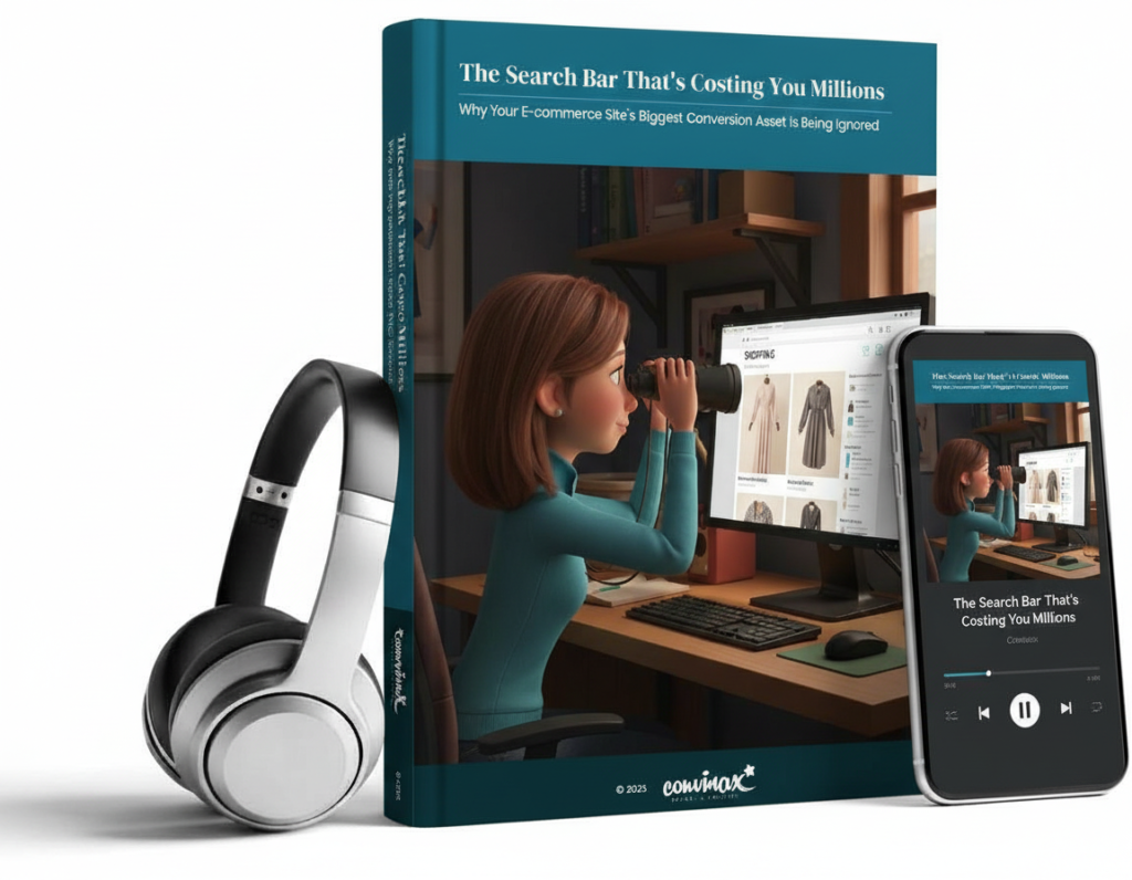
Search Bar Optimisation
Most e-commerce sites are actively making it harder for their highest-intent customers to buy. Not through broken links or slow servers, but through a fundamental misunderstanding of how people actually shop online.
The visitors who convert at 2-6x higher rates than everyone else? You’re putting obstacles in their way. The customers who spend 2.6x more per transaction? You’re forcing them to work harder than they should.
This isn’t theory. This is based on research analysing over 609 million searches, £9.8 billion in revenue, and usability testing across 325 leading e-commerce sites.
What You’ll Discover in This Article:
Your complete bundle includes:
This isn’t theory. Every recommendation is backed by academic research, field studies, and real-world case studies. You’ll get the full academic citations, the industry benchmarks, and the practical frameworks you need to implement this tomorrow.
This booklet synthesises findings from:
Common Objections
Copyright © 2026