Everyone’s Adding a Map to Their Store. Almost Nobody Should Be. (Here’s How to Know If You’re the Exception)
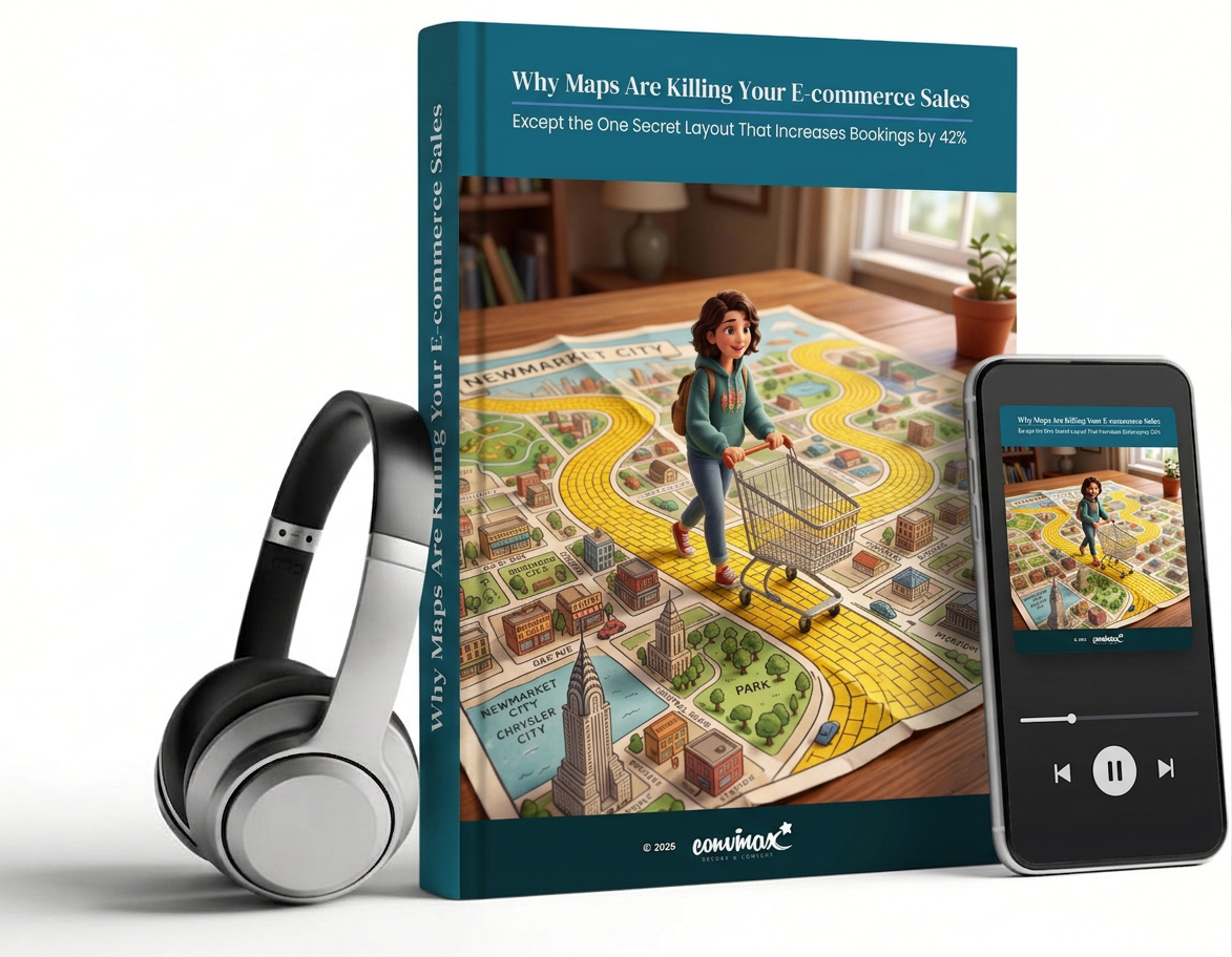
“Airbnb has a map. Zillow has a map. Uber Eats has a map. Maps are clearly the future of product discovery, so let’s put one on our site.”
Eighteen months and one agency invoice later, conversion hasn’t moved. Sometimes it’s gone backwards.
Here’s the uncomfortable part: the case for map-based search is real. It’s backed by genuine, credible research. It’s just pointed at three or four specific industries, and almost everyone borrowing the idea is borrowing it for the wrong one.
This article and its companion audio breakdown exist to save you the eighteen months. In under 20 minutes of reading, or one commute’s worth of listening, you’ll know exactly whether a map belongs on your product pages, and if it doesn’t, what actually does.
What the article reveals:
- The real reason a map lifted bookings on Airbnb, and why it has almost nothing to do with the map itself
- Why one of the biggest names in UX research found that most travel sites are hiding their own best feature from users, and what happens the moment they stop hiding it
- The specific point in the booking journey where a map stops being a discovery tool and starts being something else entirely
- Why a well-known study found that people’s stated preference for visual browsing and their actual measured behaviour flatly contradict each other
- The counterintuitive fix three separate engineering teams landed on, independently, after their maps got more crowded, not less useful
- A peer-reviewed study that pitted a traditional shop menu against a completely different way of organising products, and the margin by which it won will make you question your entire category structure
- The one question that predicts, more reliably than any feature checklist, whether an interface will convert