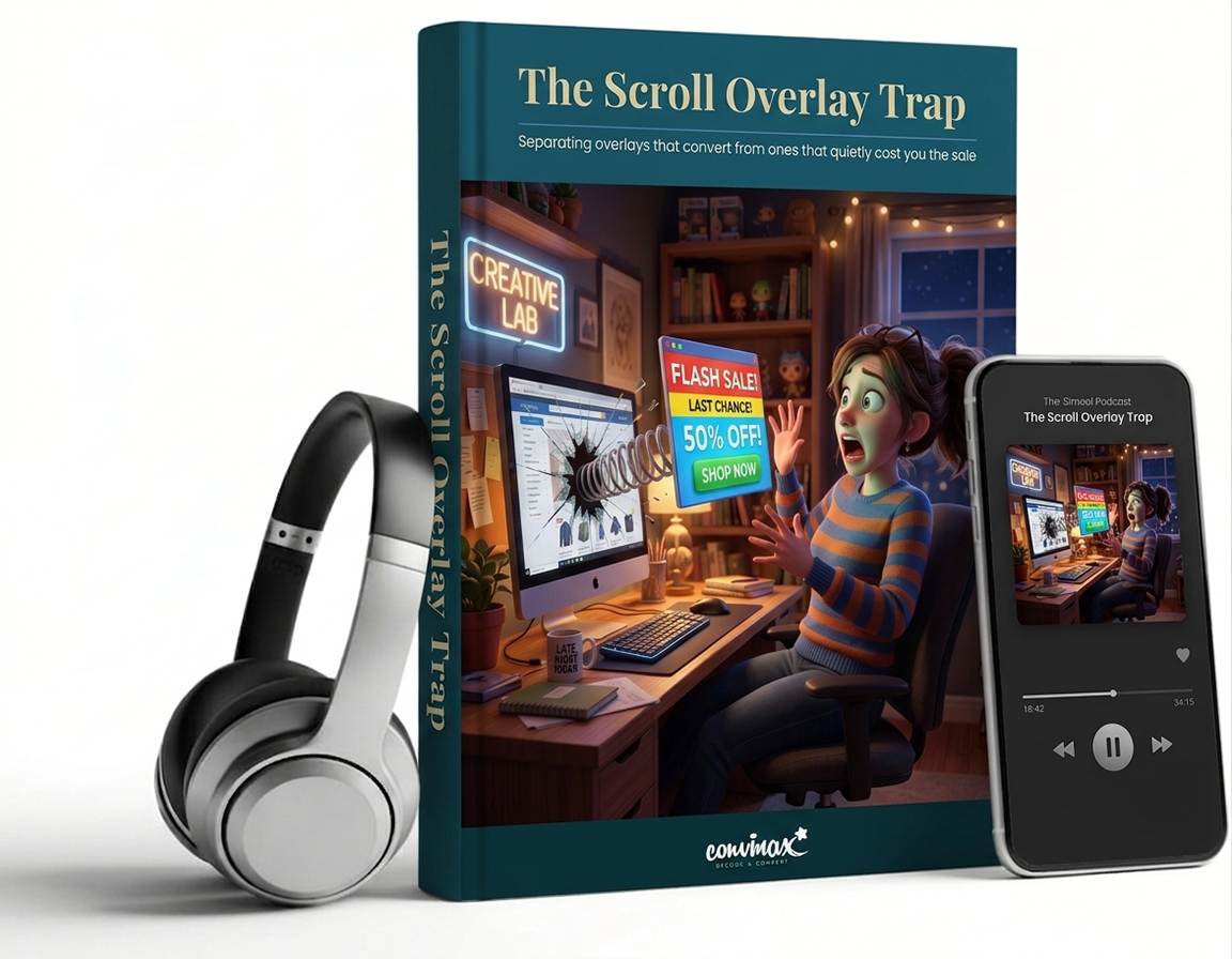
Your Scroll Popup Is Either Making You Money Or Quietly Costing You Sales. Here’s How To Know Which.
Somewhere around the halfway point of your product page, a box slides in. “Exclusive offer.” “Before you go…” Someone on your team installed it because a competitor has one, or because a plugin recommended it. Nobody’s actually checked whether it’s helping or hurting since.
Here’s the uncomfortable part: most businesses running a scroll-triggered popup right now are running one of the weakest-converting tactics in e-commerce, without knowing it. Some are quietly taxing every visitor who scrolls past the fold. A few have accidentally built one of the highest-converting recovery tools available. The difference between the two isn’t luck, and it isn’t design taste. It’s whether you’ve read the evidence.
Most people haven’t. That’s the gap this article closes.
This isn’t opinion, and it isn’t “10 popup hacks” recycled from a marketing blog. It’s a research-backed breakdown of exactly when scroll overlays work, when they quietly bleed conversions, and how to tell which one you’re running – built from usability testing across 4,400+ real e-commerce sessions, an analysis of over a billion popup impressions, peer-reviewed studies on cognitive load and decision fatigue, and real A/B tests from brands like Cloudways, Etsy, Somfy and Ubisoft.
By the end, you’ll have a specific, testable framework for building (or fixing) an overlay that respects your customer’s attention instead of ambushing it – plus the checklist to prove, with your own data, that it’s actually working. Paired with the audio version for your commute, gym session, or dog walk.
What the article reveals:
- The article reveals exactly what happens inside your customer’s brain the moment your overlay appears – and why researchers can now watch it happen in real time.
- It reveals how much of a shopper’s attention is even available below the fold by the time your popup fires – and it’s a lot less than most teams assume.
- It reveals why one major retailer’s overlay change looked like an obvious win on paper, and cost them 22% of their conversions in practice.
- It reveals which single trigger converts more than ten times better than the one most stores default to – and why almost nobody uses it first.
- It reveals the exact scroll depth and combination of triggers that took one SaaS company’s free trial sign-ups up 120%, by changing nothing except when the popup appeared.
- It reveals the one popup type usability researchers say is almost always acceptable– and why it’s not the one on your homepage.
- It reveals why your mobile popup is very likely working against you twice as hard as your desktop one, and the specific size and placement fix for it.
- It reveals the 12-word rule the highest-converting exit offers all follow, and why longer copy quietly kills them.